ICONOCLAST
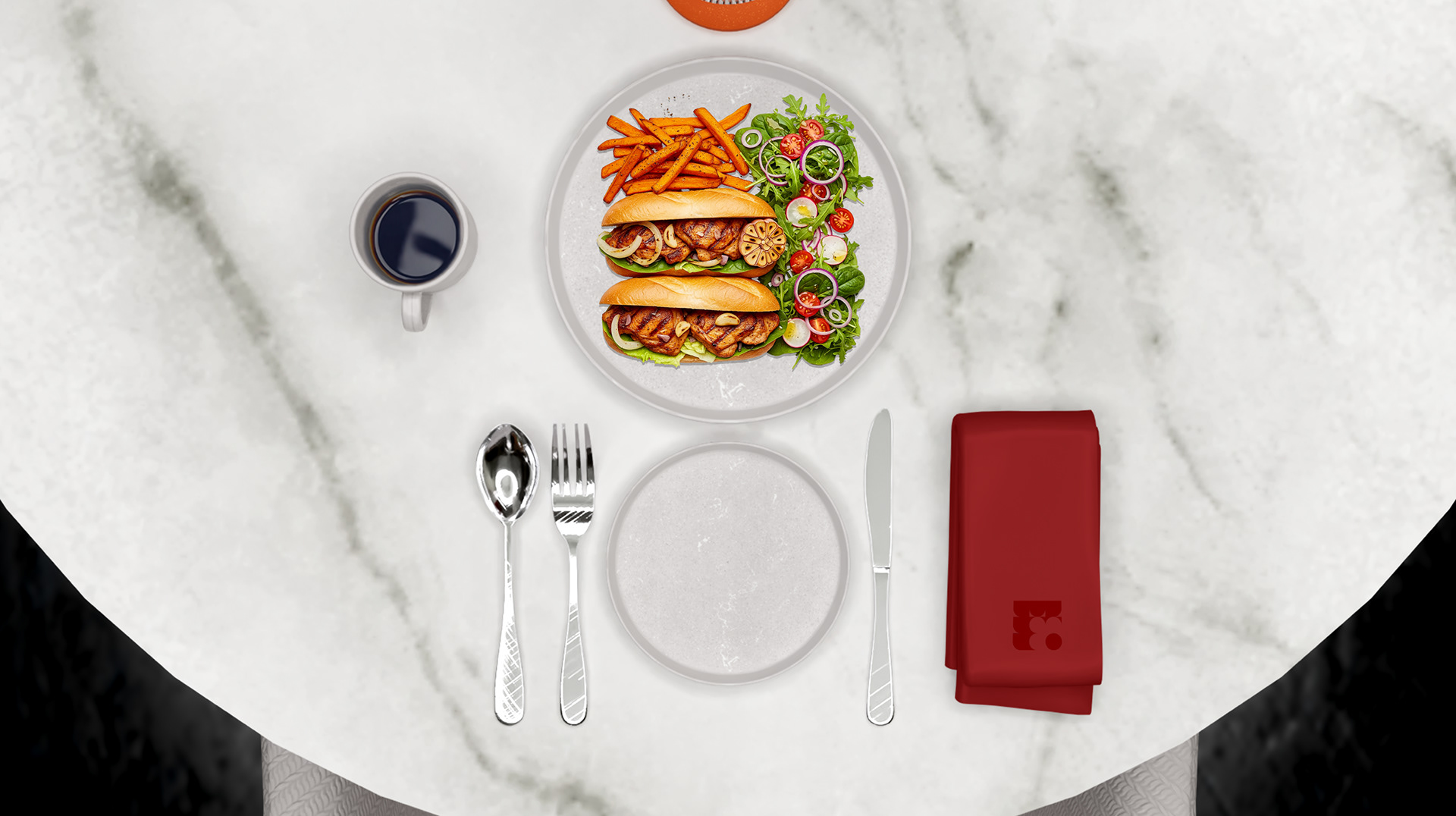
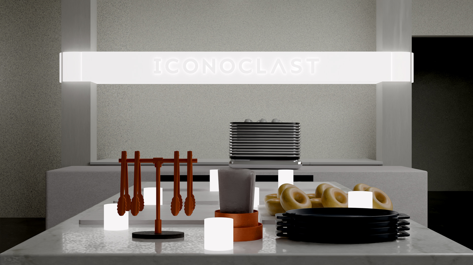
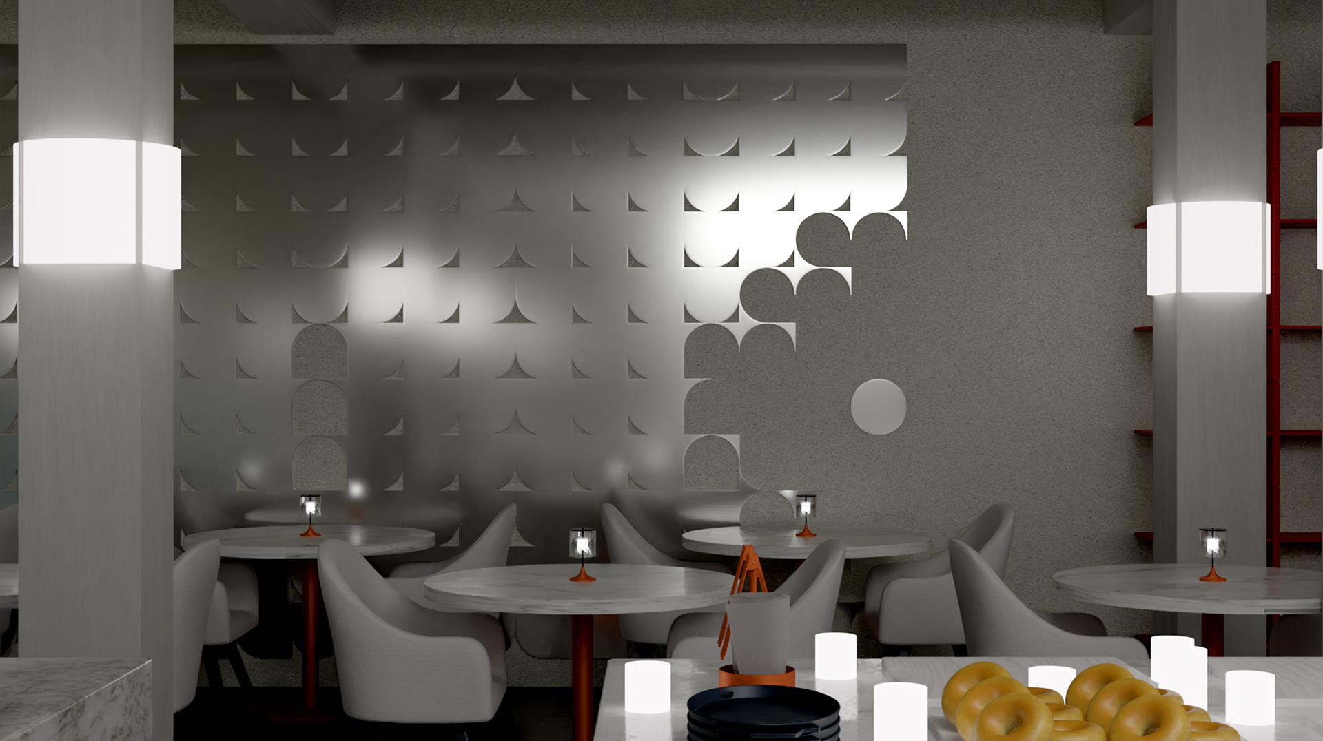
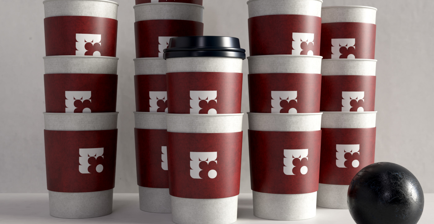
The innovative coffee shop, café, and restaurant brand 'Iconoclast' originated from a college project. The main objective was to create a cohesive and convincing menu layout for an imaginary café inside a local art center. Building on this original brief, the expansion into a complete story of the brand began to elevate the imagined user experience of both café visitors and art patrons. By combining and harmonizing the contrast between gray concrete and black marble with hints of red accents, Iconoclast exudes a modern, urban, yet approachable aesthetic.
The main challenge of this project was to craft a convincing brand story and a collection of immersive details that support its quality.
혁신적인 커피숍, 카페, 그리고 레스토랑 브랜드인 아이코노클래스트는 대학 프로젝트에서 시작되었습니다. 이 프로젝트의 주요 목표는 지역 아트센터 내에 있는 가상의 카페를 위한 일관성 있고 설득력 있는 메뉴 레이아웃을 만드는 것이었습니다. 이 초기 기획을 바탕으로, 브랜드의 전체적인 스토리를 확장하여 카페 방문객과 예술 애호가 모두의 상상 속 사용자 경험을 한층 더 끌어올리기 시작했습니다. 회색 콘크리트와 검은 대리석의 대비에 붉은색 포인트를 더해 조화롭게 결합함으로써, 아이코노클래스트는 현대적이고 도시적인 동시에 친근한 미학을 자아냅니다.
이 프로젝트의 주요 과제는 설득력 있는 브랜드 스토리와 그 품질을 뒷받침하는 몰입감 있는 디테일들을 만들어내는 것이었습니다.
Client - Iconoclast Cafe & Bakery (Imaginary Personal Project)
Services - Branding, Package Design, Menu Design, Concept Design, 3D Rendering
Programs - Photoshop, Illustrator, InDesign, After Effects, Dimension
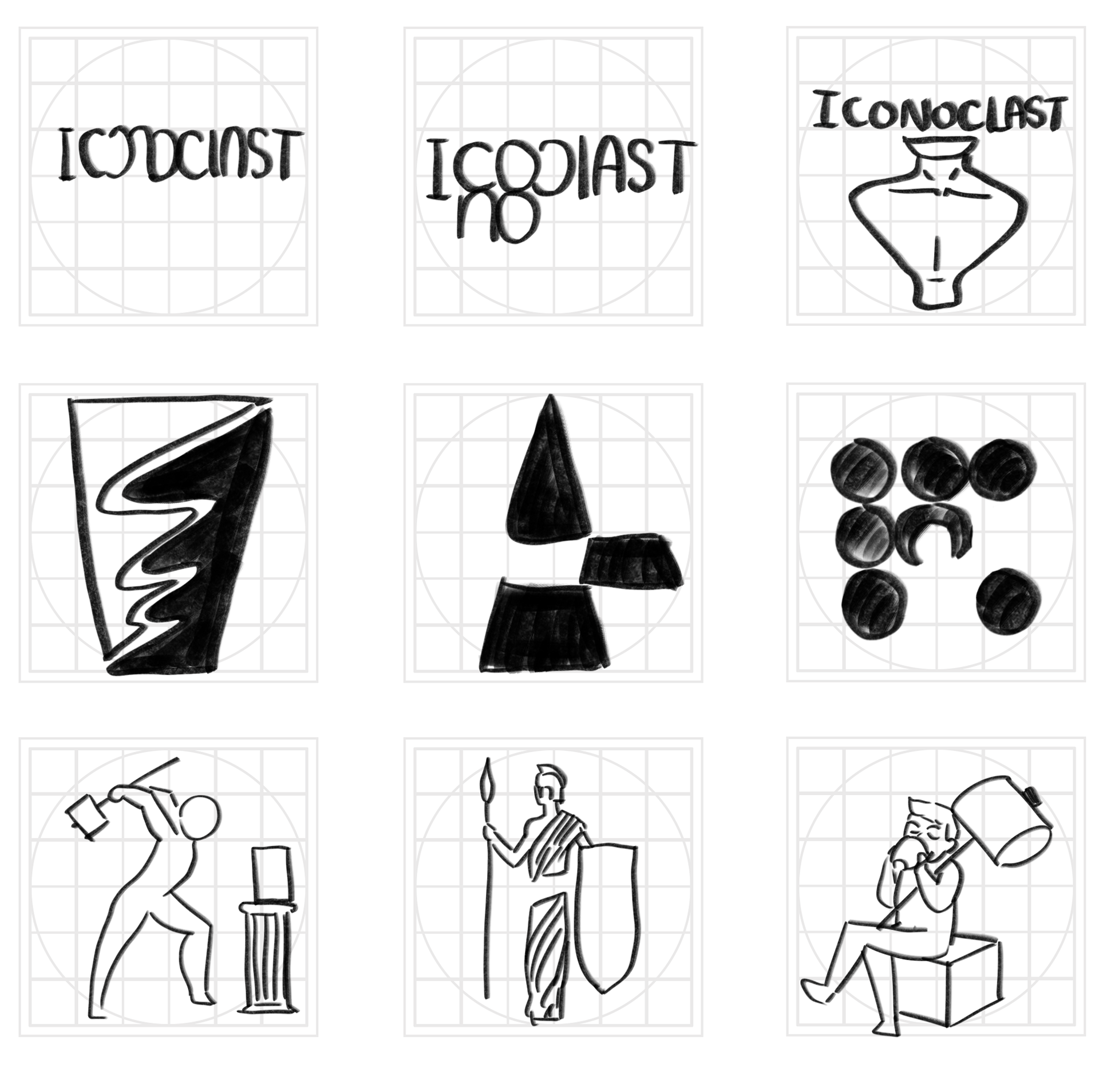
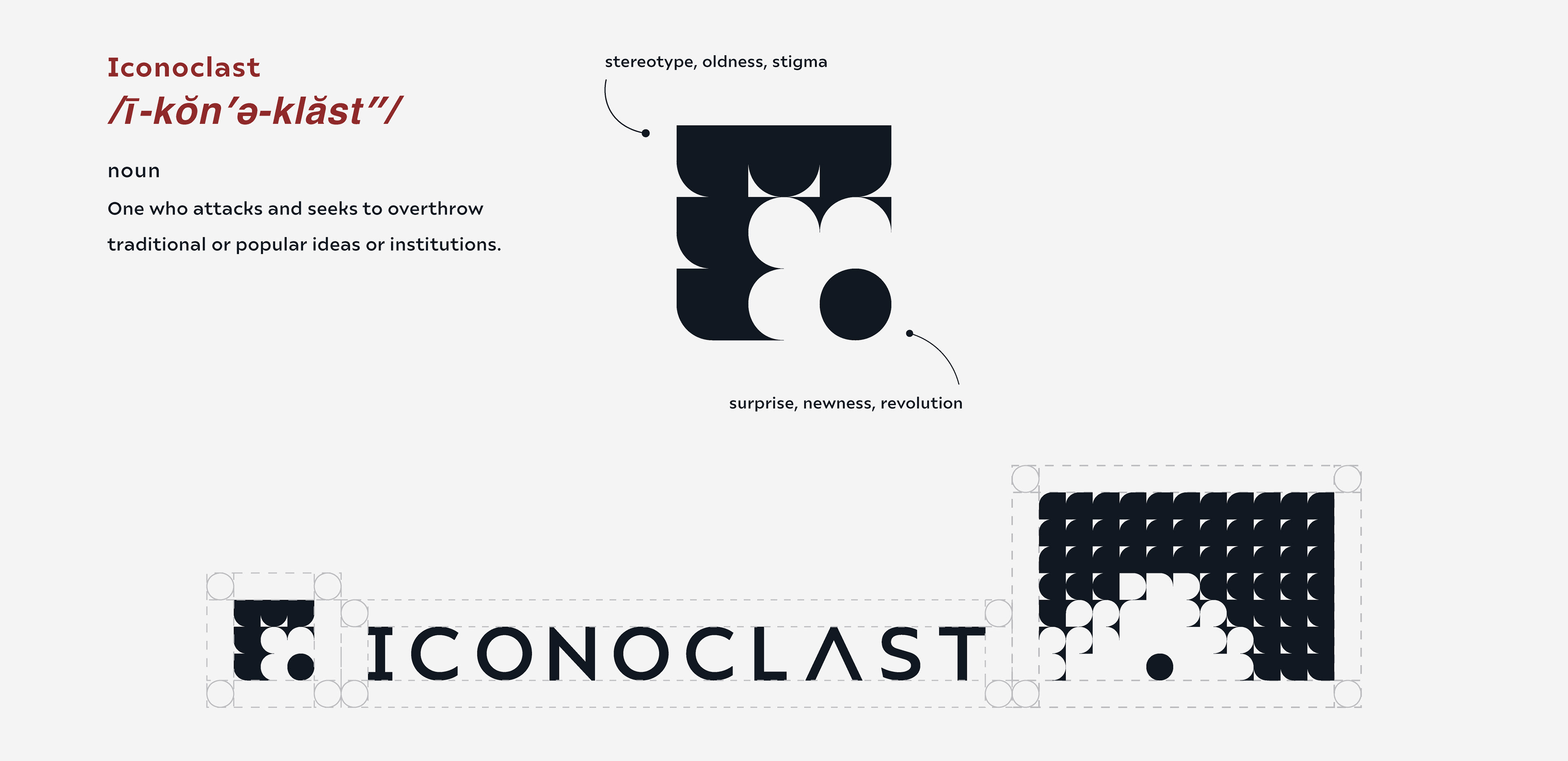
Logo Design
The logo originates from the concept of a monolith, a stoic object interpreted as embodying old traditions and stigmas. The circle beneath signifies the brand's bold statement of reshaping the mundane and repetitive café industry and its culinary counterpart's category.
로고는 모놀리스를 모티브로 하였습니다. 모놀리스는 오랜 전통과 고정관념을 담고 있는, 묵직하고 절제된 오브젝트로 해석됩니다. 그 아래의 원은 일상적이고 반복적인 카페 산업과 그와 관련된 미식 분야를 새롭게 재해석하겠다는 브랜드의 대담한 의지를 상징합니다.
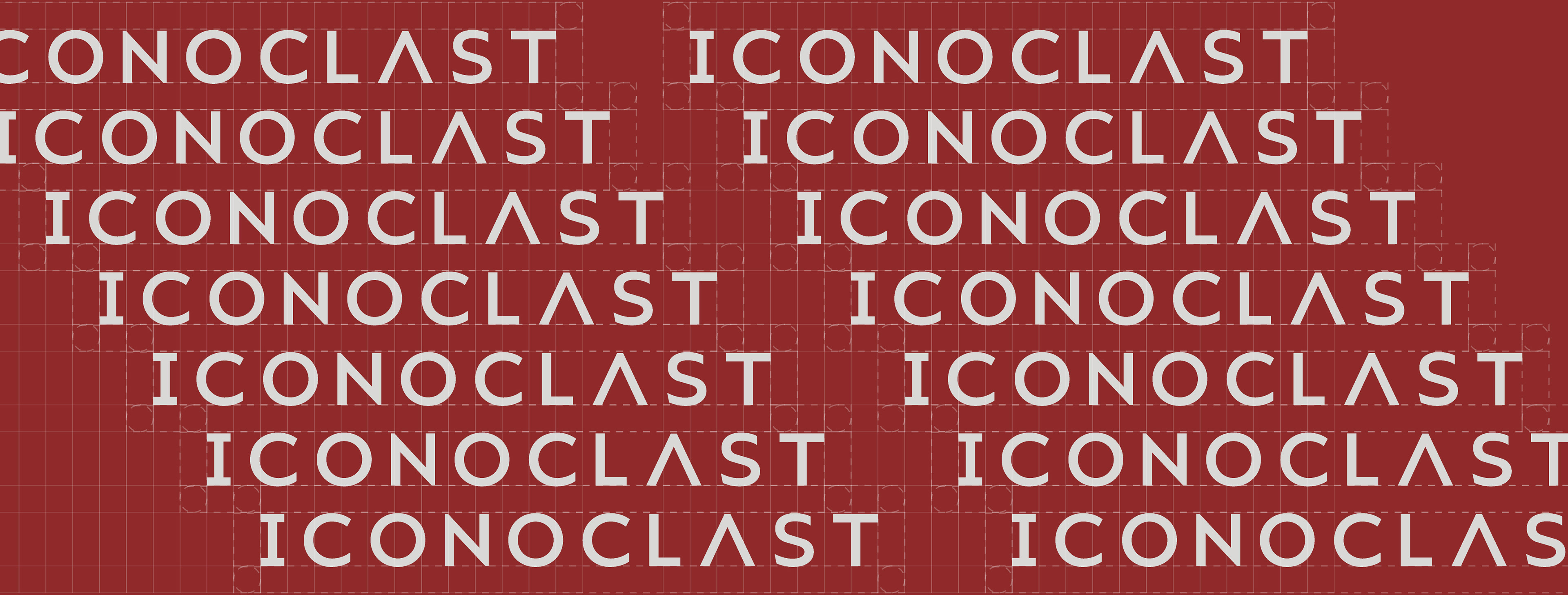

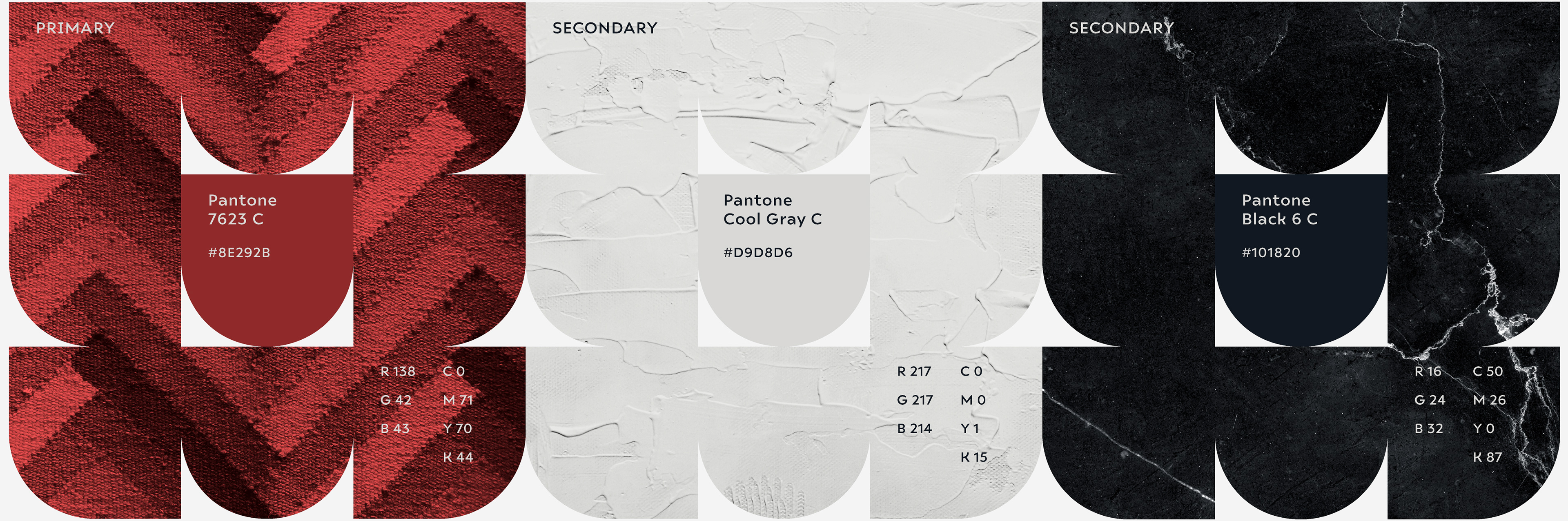
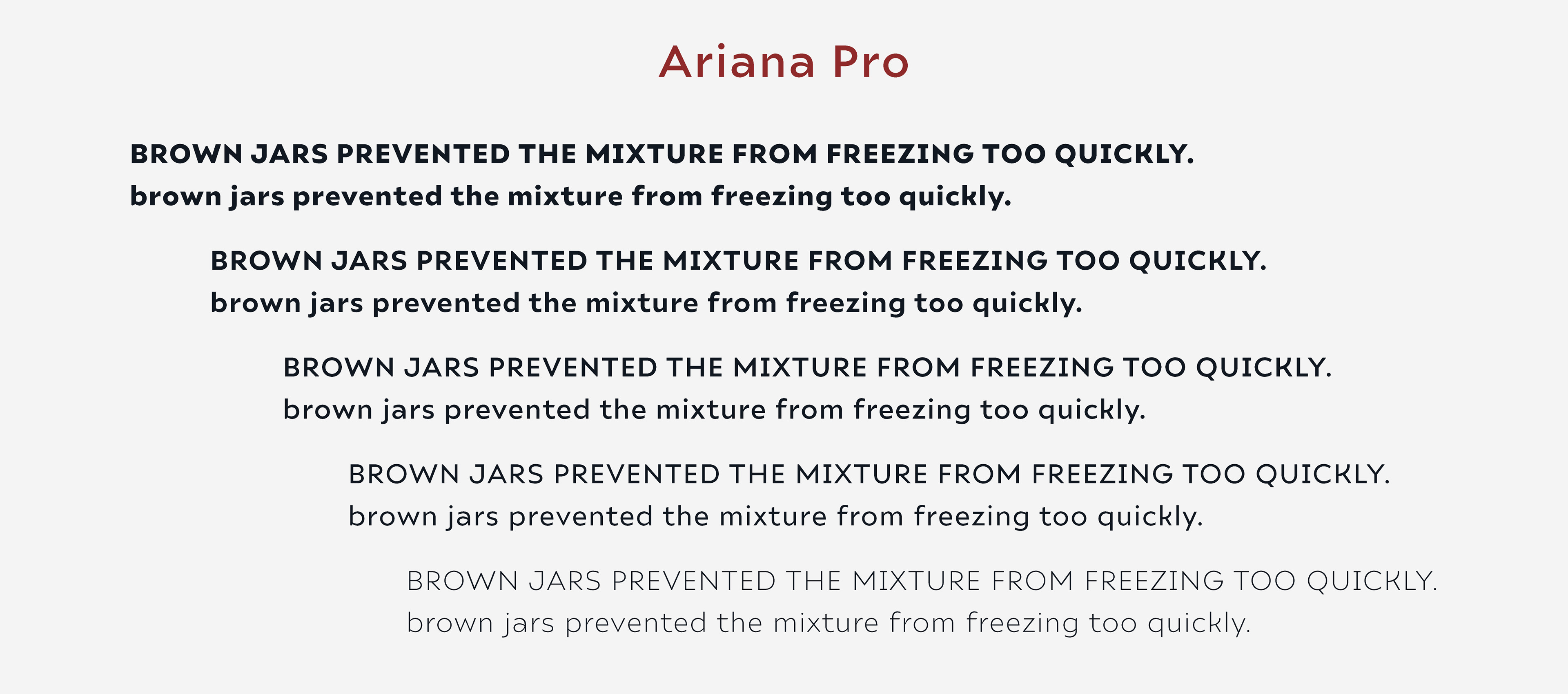
Brand Colors & Typeface
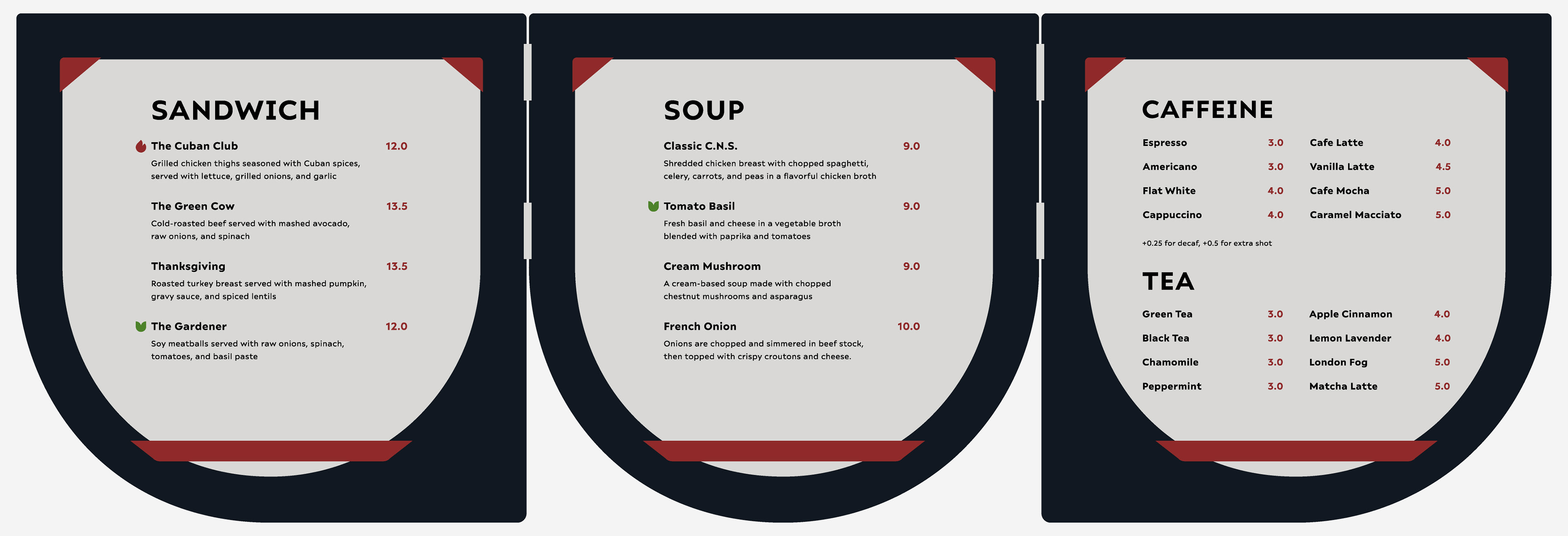
Menu Design
The Iconoclast menu uses bold geometric shapes and clear color contrasts to create a modern, organized look that’s easy to navigate. Each section—sandwich, soup, caffeine, and tea—is visually separated, with straightforward typography and red accents guiding the eye. This design reflects the brand’s urban, approachable style and helps customers quickly find what they want, blending function with a strong brand identity.
아이코노클라스트의 메뉴는 대담한 기하학적 형태와 명확한 색상 대비를 활용해 현대적이고 체계적인 느낌을 주며, 메뉴의 이동도 쉽게 할 수 있도록 설계되어 있습니다. 샌드위치, 수프, 커피, 그리고 티 각 섹션은 시각적으로 명확하게 구분되어 있으며, 직관적인 타이포그래피와 빨간색 포인트로 시선을 자연스럽게 안내합니다. 이러한 디자인은 브랜드의 도시적이면서도 친근한 스타일을 반영하며, 고객이 원하는 메뉴를 빠르게 찾을 수 있도록 도와줍니다. 기능성과 강력한 브랜드 정체성이 어우러진 결과물입니다.
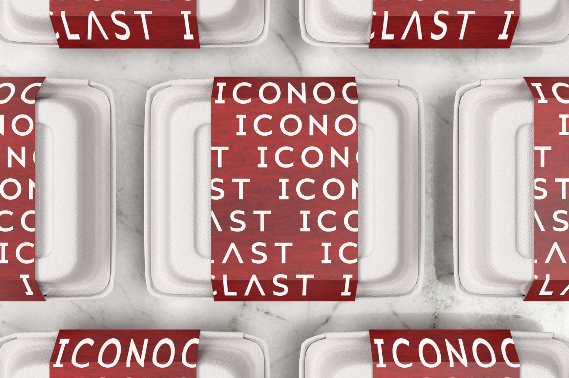
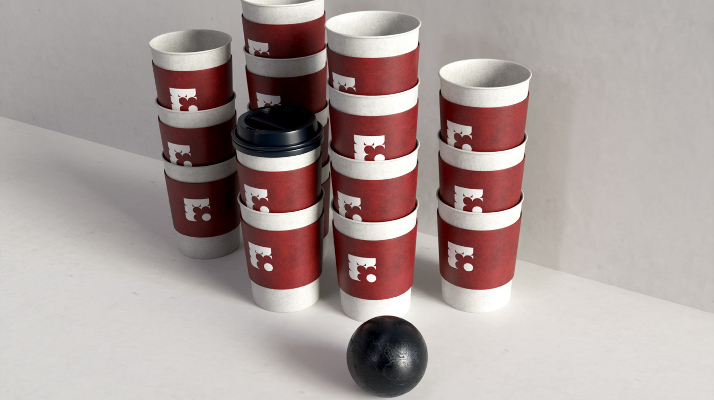
3D Renders