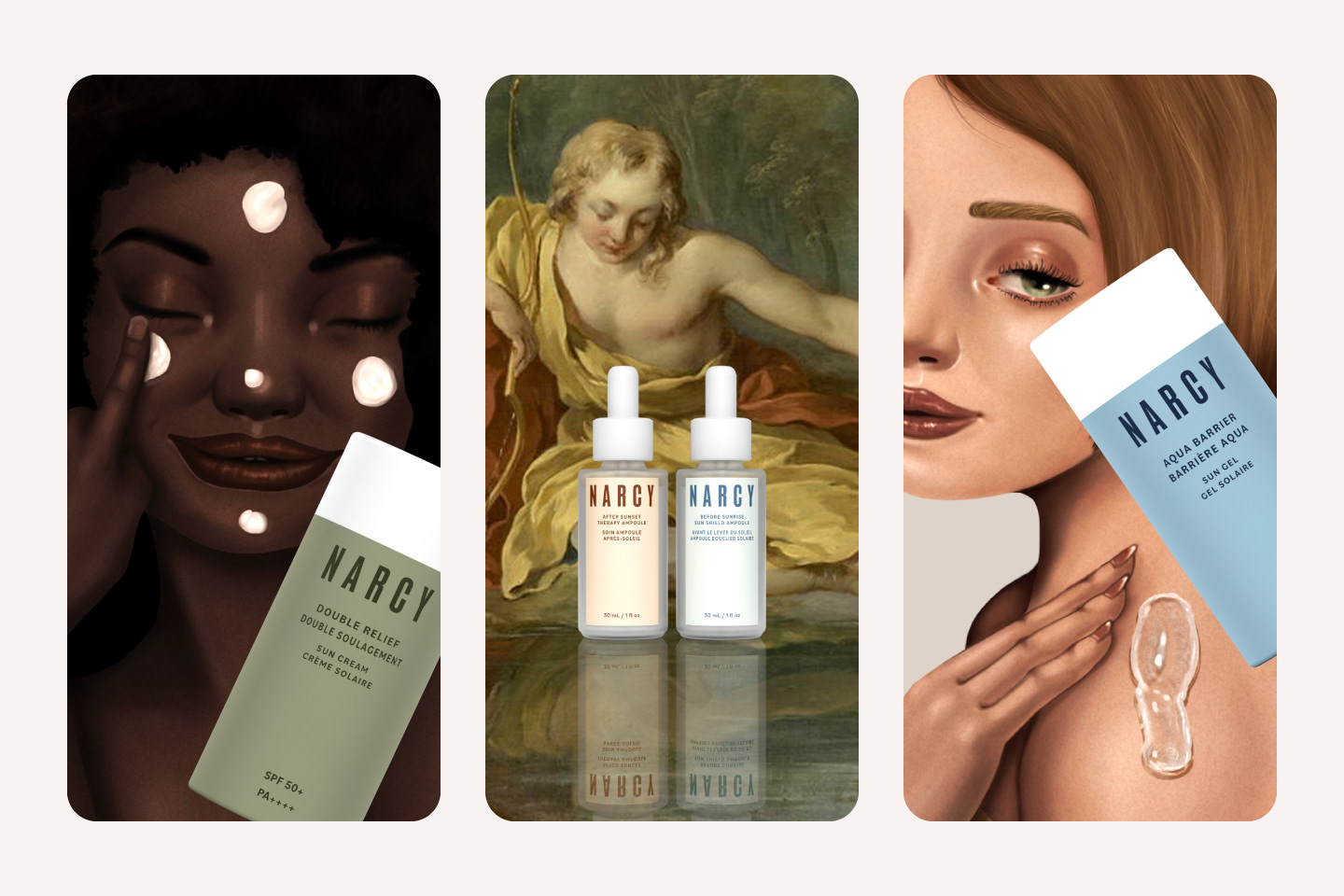
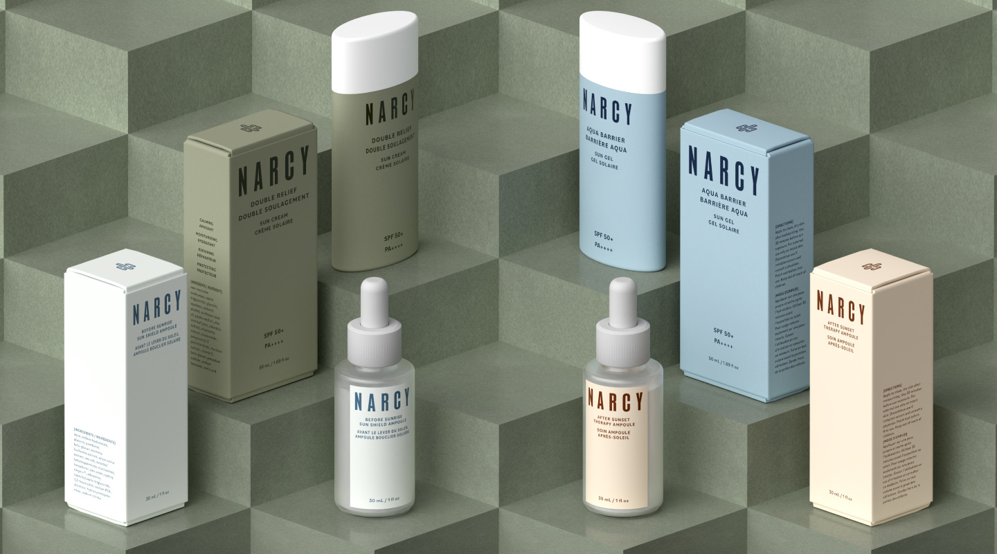
NARCY
Narcy was born from a real need: the struggle to find affordable, effective, and gentle skincare in Canada. Frustrated by budget limitations and common sunscreen issues—such as white cast, mismatched tones, and irritation—Narcy set out to create a solution. The result is a line of eco-friendly, accessible products that deliver visible results without compromise.
나르시는 실제적인 필요에서 탄생한 브랜드입니다. 캐나다에서 합리적인 가격에 효과적이면서도 자극이 적은 스킨케어 제품을 찾기 어려웠던 경험, 그리고 선크림의 백탁 현상, 피부 톤 불일치, 자극 등 흔히 겪는 문제에 대한 좌절감이 출발점이었습니다. 이러한 한계를 극복하고자 나르시는 타협 없는 가시적 효과를 제공하는 친환경적이고 접근성 높은 제품 라인을 개발했습니다.
Client - Narcy (Imaginary Personal Project)
Services - Branding, Package Design, Illustration, Concept Design, 3D Rendering
Programs - Photoshop, Illustrator, Dimension, Procreate
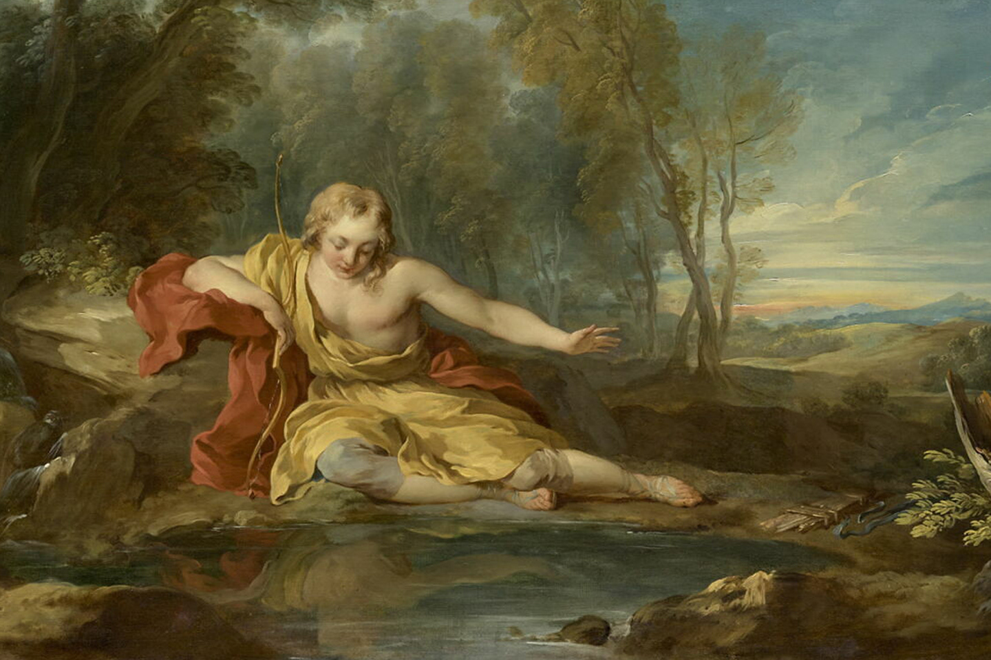
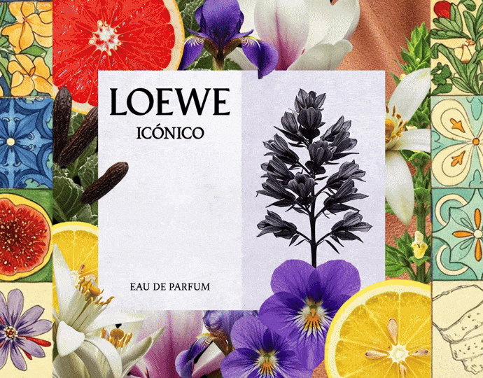
Narcisse contemplant son reflet dans l'eau by François Lemoyne
Nar·cis·sist (나르시시스트)
A person who admires themselves (자기애가 강한 사람)
Rooted in the myth of Narcissus, whose story is often associated with vanity, Narcy reclaims the narrative. The brand transforms this legacy, empowering individuals to embrace confidence, self-love, and extraordinary beauty through everyday rituals.
나르시의 브랜드 스토리는 흔히 허영의 상징으로 여겨지는 나르키소스 신화에서 영감을 받았습니다. 그러나 나르시는 이 신화의 의미를 새롭게 해석하여, 자신감과 자기애, 일상의 아름다움을 실천하는 힘으로 승화시킵니다. 나르시는 일상 속 루틴을 통해 누구나 자신의 아름다움을 당당하게 받아들일 수 있도록 돕습니다.
Logo Story
Every day, people face their reflection, experiencing a spectrum of emotions. In Greek mythology, Narcissus fell deeply in love with his beauty, a moment of true self-recognition and love. Inspired by this positive aspect, I designed the Narcy symbol to help everyone view themselves confidently and satisfactorily. Just as we look seriously or smile before the mirror, Narcy delivers a message of positive energy.
사람은 매일 거울 속 자신을 마주하며 다양한 감정을 느낍니다. 그리스 신화의 나르키소스는 자신의 아름다움에 깊이 빠져들었고, 이는 진정한 자기 인식과 사랑의 순간이었습니다. 저는 이 긍정적 의미에서 영감을 받아, 누구나 자신을 자신감 있게 바라보고 만족할 수 있도록 나르시의 심볼을 디자인했습니다. 거울 앞에서 진지하게 자신을 들여다보거나 미소 짓는 모습처럼, 나르시는 긍정의 에너지를 전합니다.
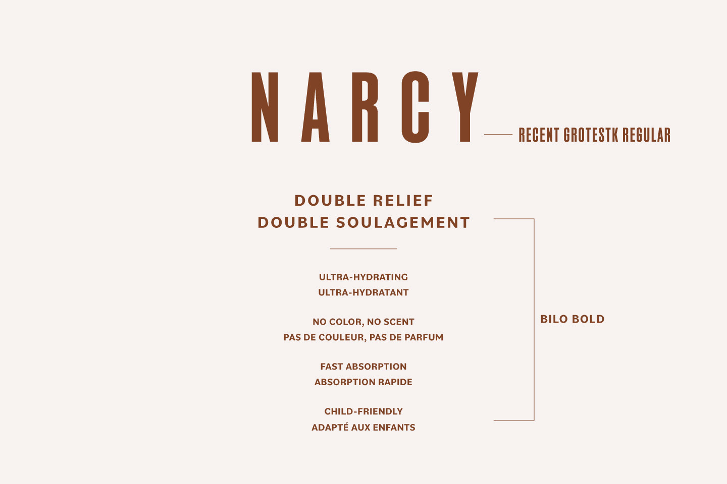
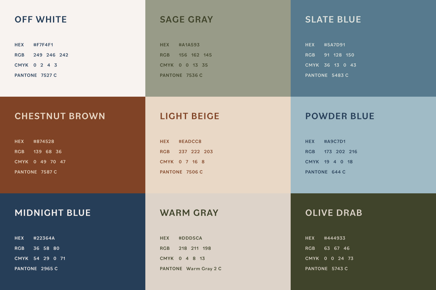
Colors & Typefaces
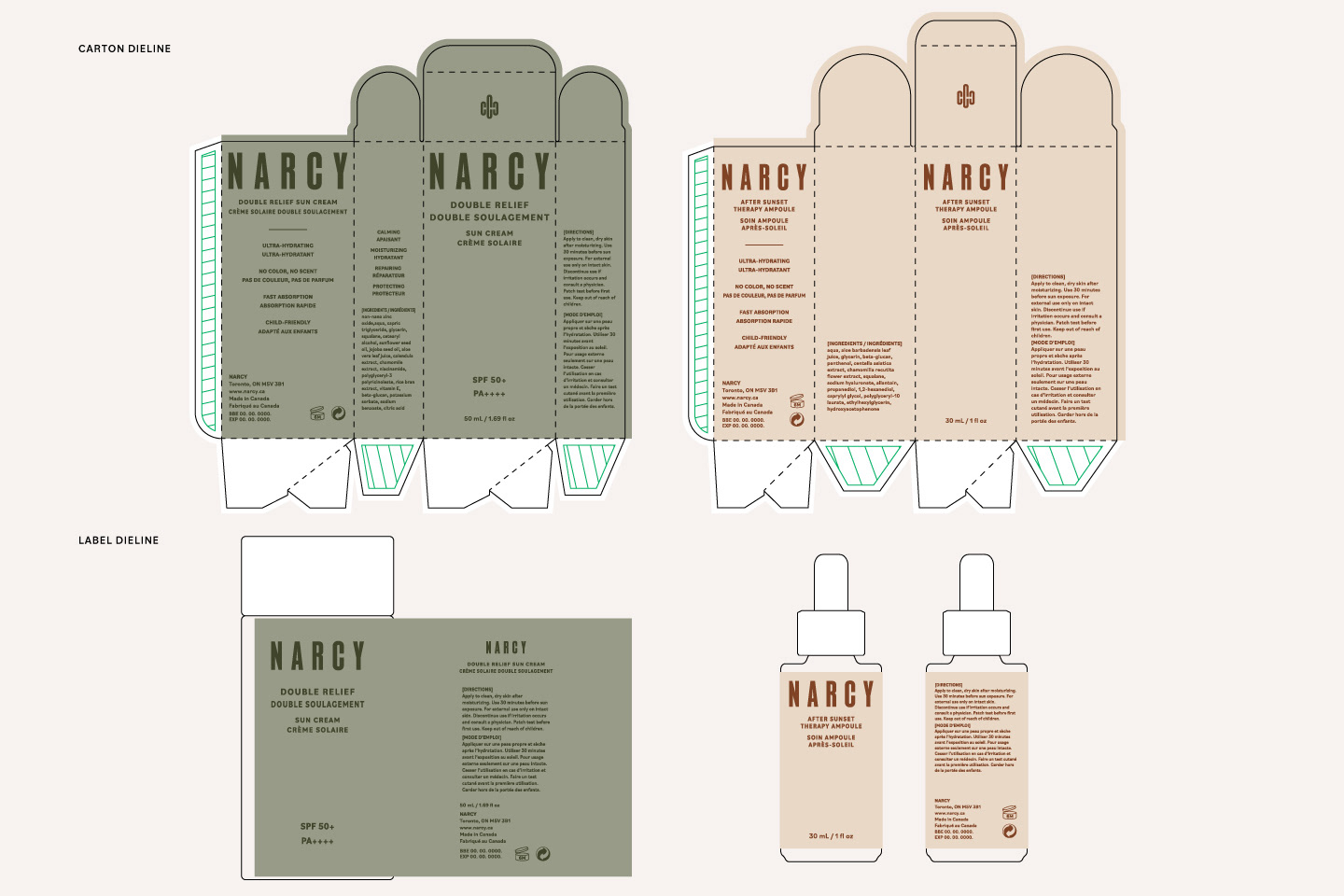
Packaging Principle
Narcy’s carton and label suggest care and renewal using soft colors and organic shapes. The clean layout matches the brand’s promise of simple, transparent skincare. Clear product information also builds trust and makes it easy to understand the benefits.
나르시의 패키징은 부드러운 색감과 유기적인 형태를 활용해 배려와 재생의 이미지를 제시합니다. 깔끔한 레이아웃은 브랜드가 추구하는 단순하고 투명한 스킨케어의 약속과 잘 어울립니다. 또한 명확한 제품 정보는 신뢰를 높이고, 제품의 혜택을 쉽게 이해할 수 있도록 도와줍니다.
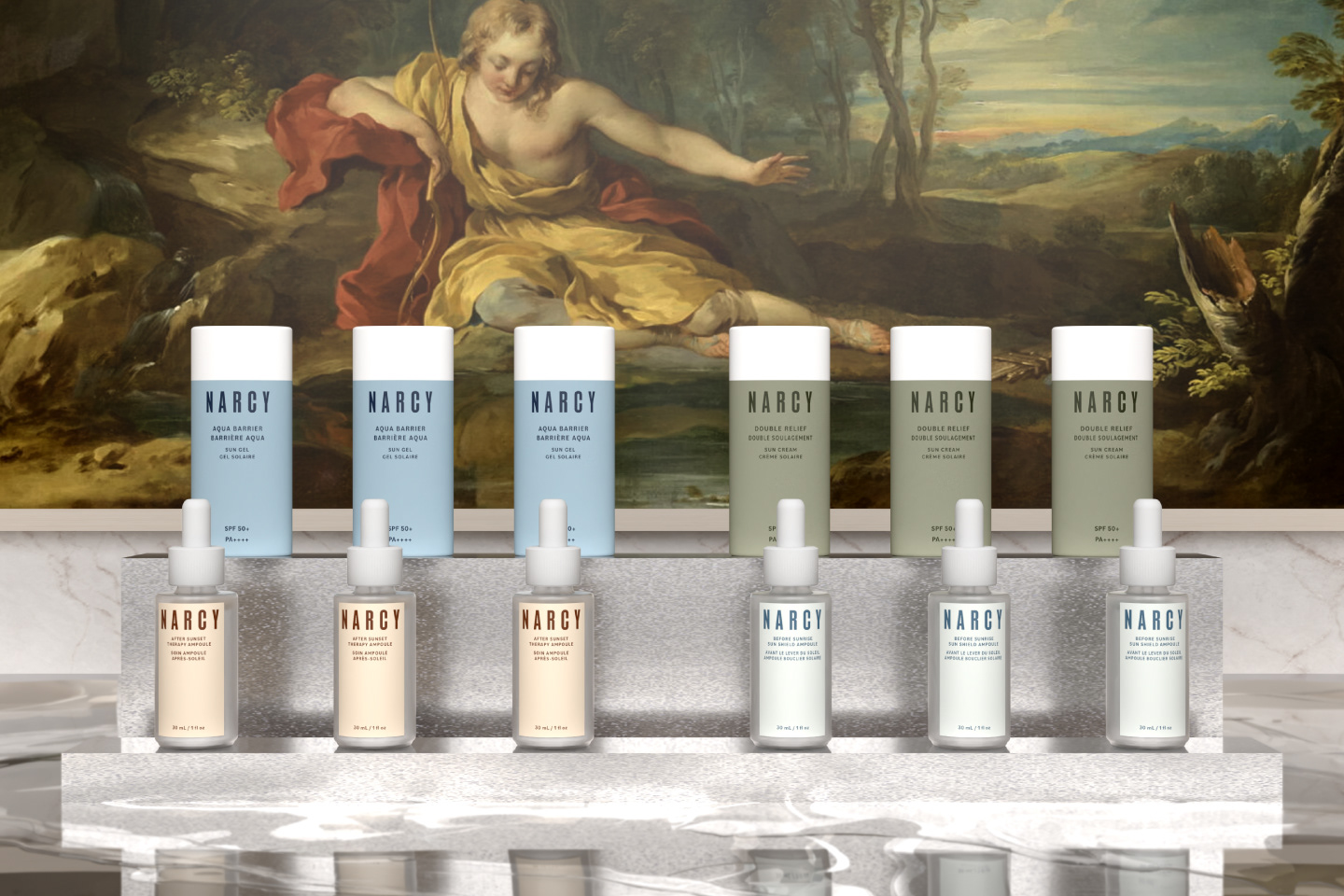
3D Renders

Social Media