Royal Ontario Museum
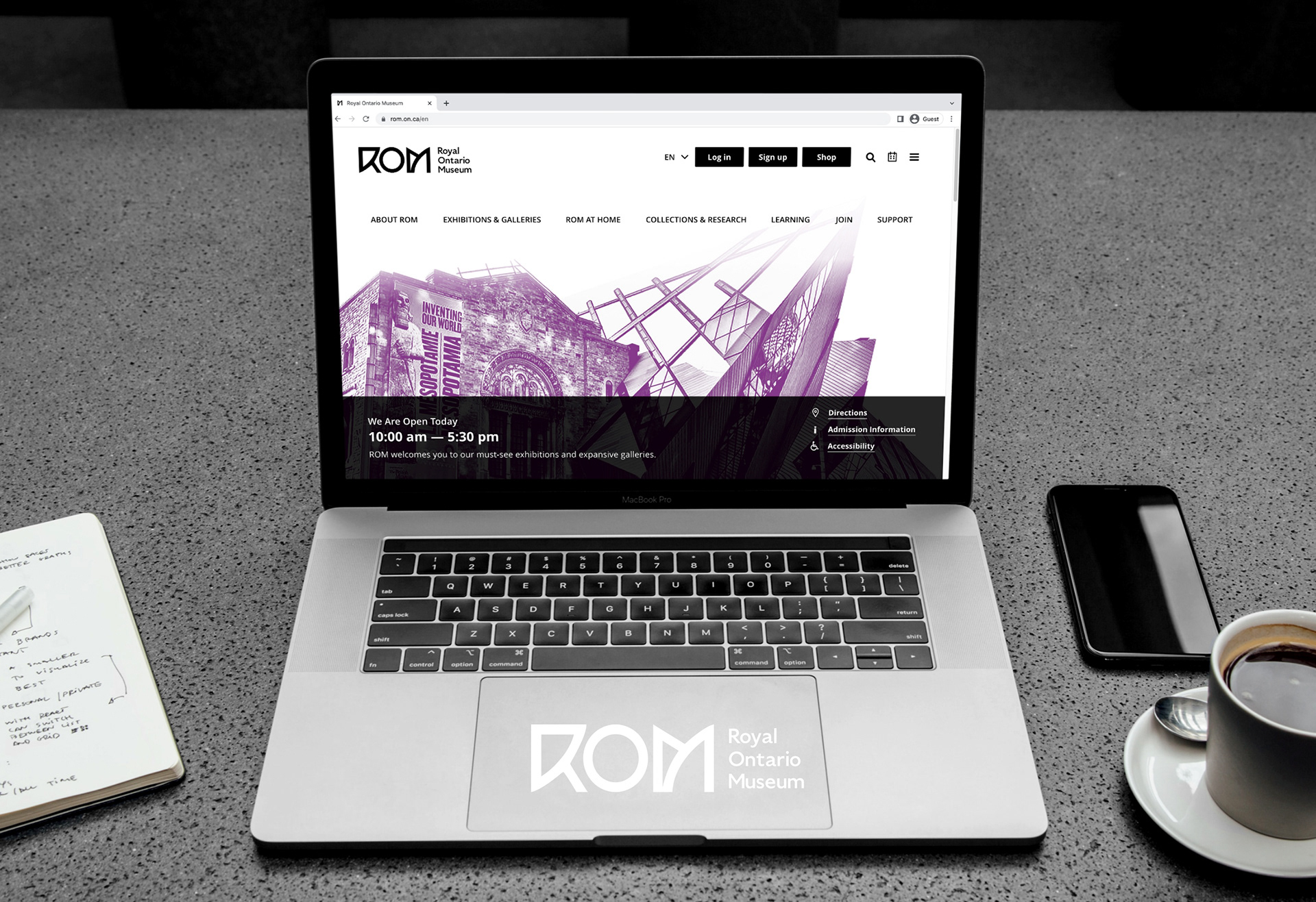
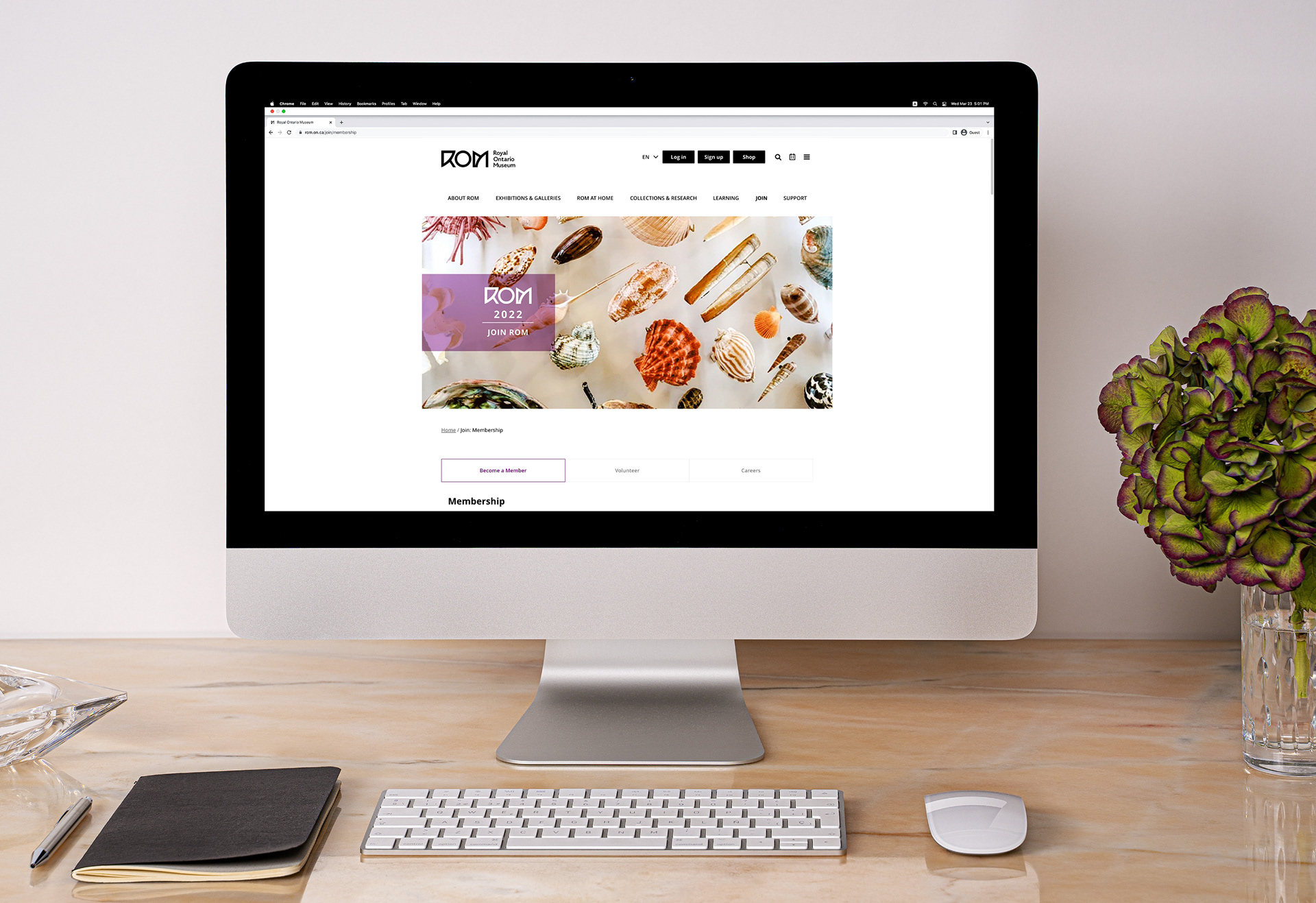
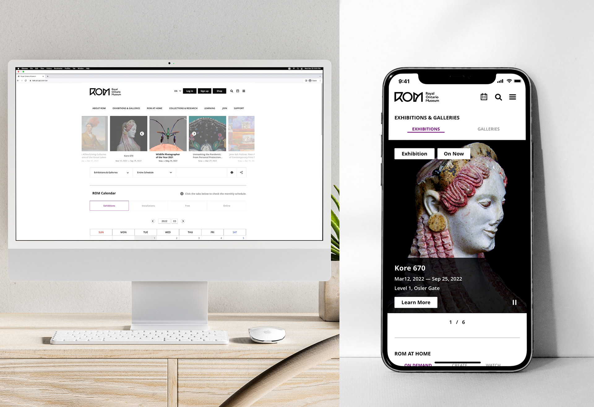
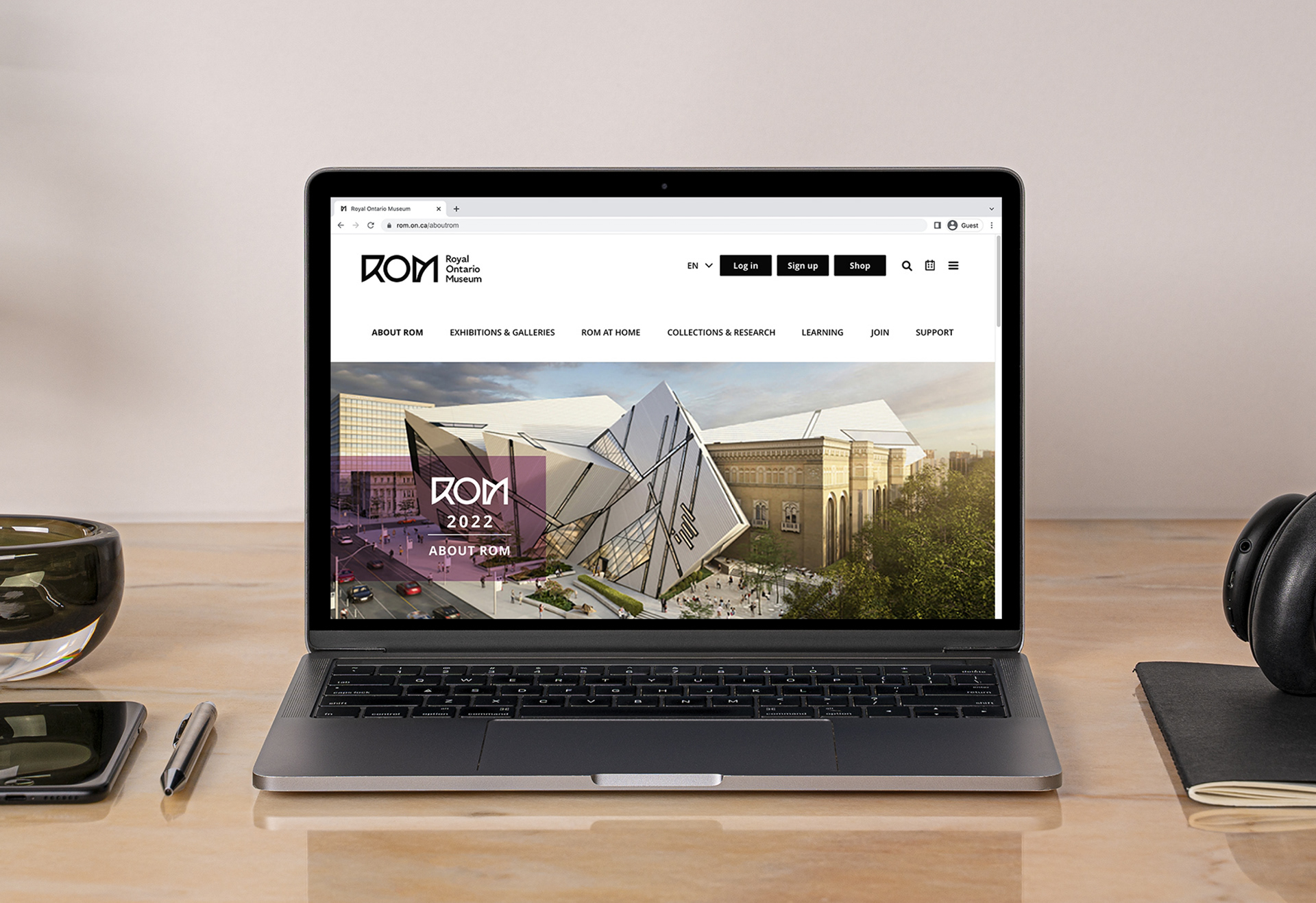
The project to redesign the Royal Ontario Museum’s (ROM) online platform began as an initiative to reimagine digital experiences across the web and mobile. The new system emphasizes clear event comprehension, faster booking, and efficient navigation. A centralized calendar combines all exhibitions and events into one interface for easier access. The design draws from the museum’s architectural duality, merging historic castle-like structures with modernist facades.
로열 온타리오 박물관(ROM) 온라인 플랫폼 리디자인 프로젝트는 웹과 모바일에서의 디지털 경험을 혁신하기 위해 시작되었습니다. 새 시스템은 이벤트 정보의 명확한 전달, 빠른 예약, 효율적인 내비게이션에 중점을 두었습니다. 모든 전시와 행사는 통합 캘린더에서 쉽게 확인할 수 있습니다. 디자인은 박물관의 고전적인 성 구조와 현대적 외관이 어우러진 건축적 특징을 시각적으로 반영합니다.
Client - Royal Ontario Museum (Imaginary Personal Project)
Services - Branding, Concept Design, Redesign, UX & UI Design
Programs - Photoshop, Illustrator, XD
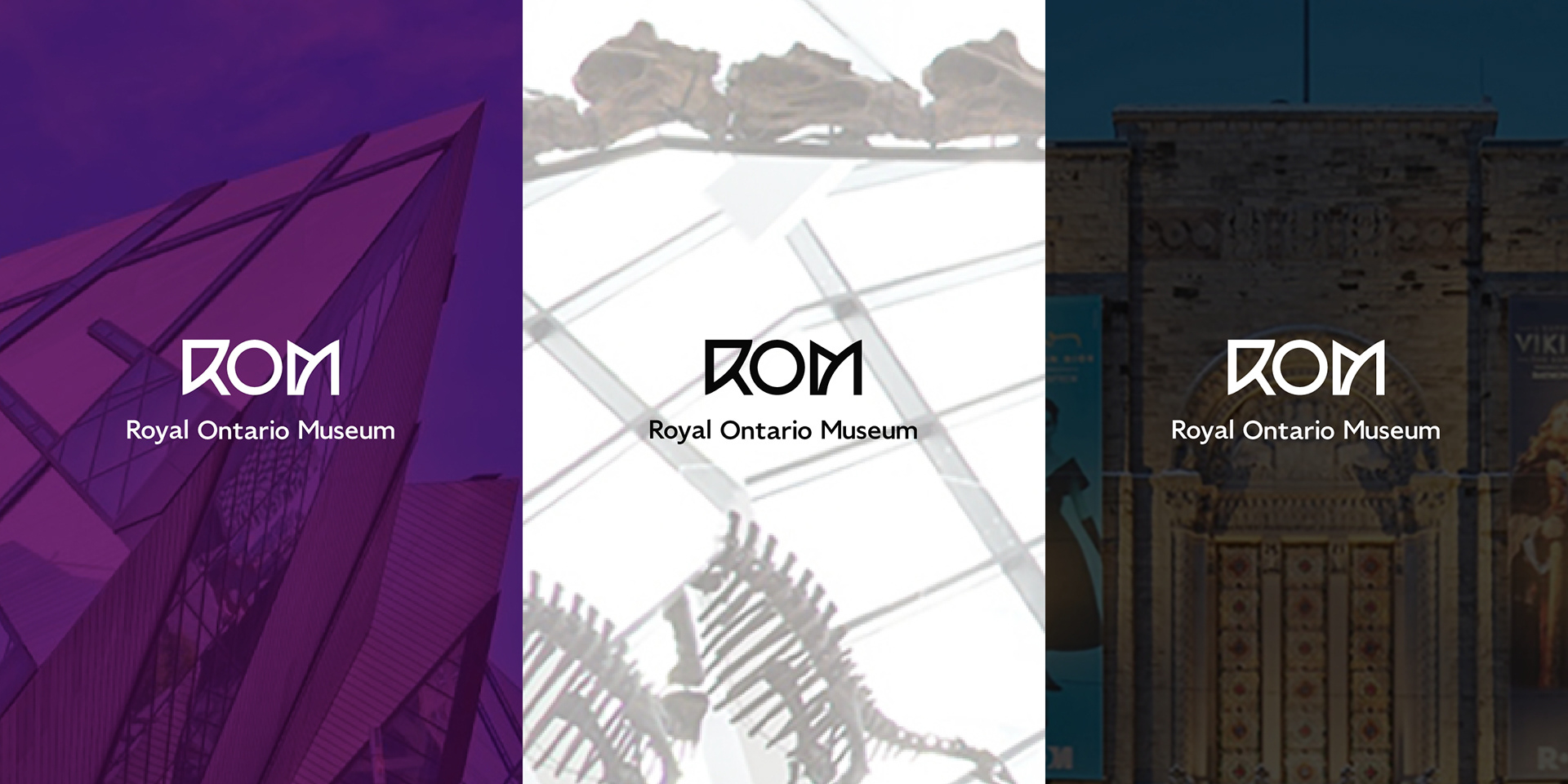
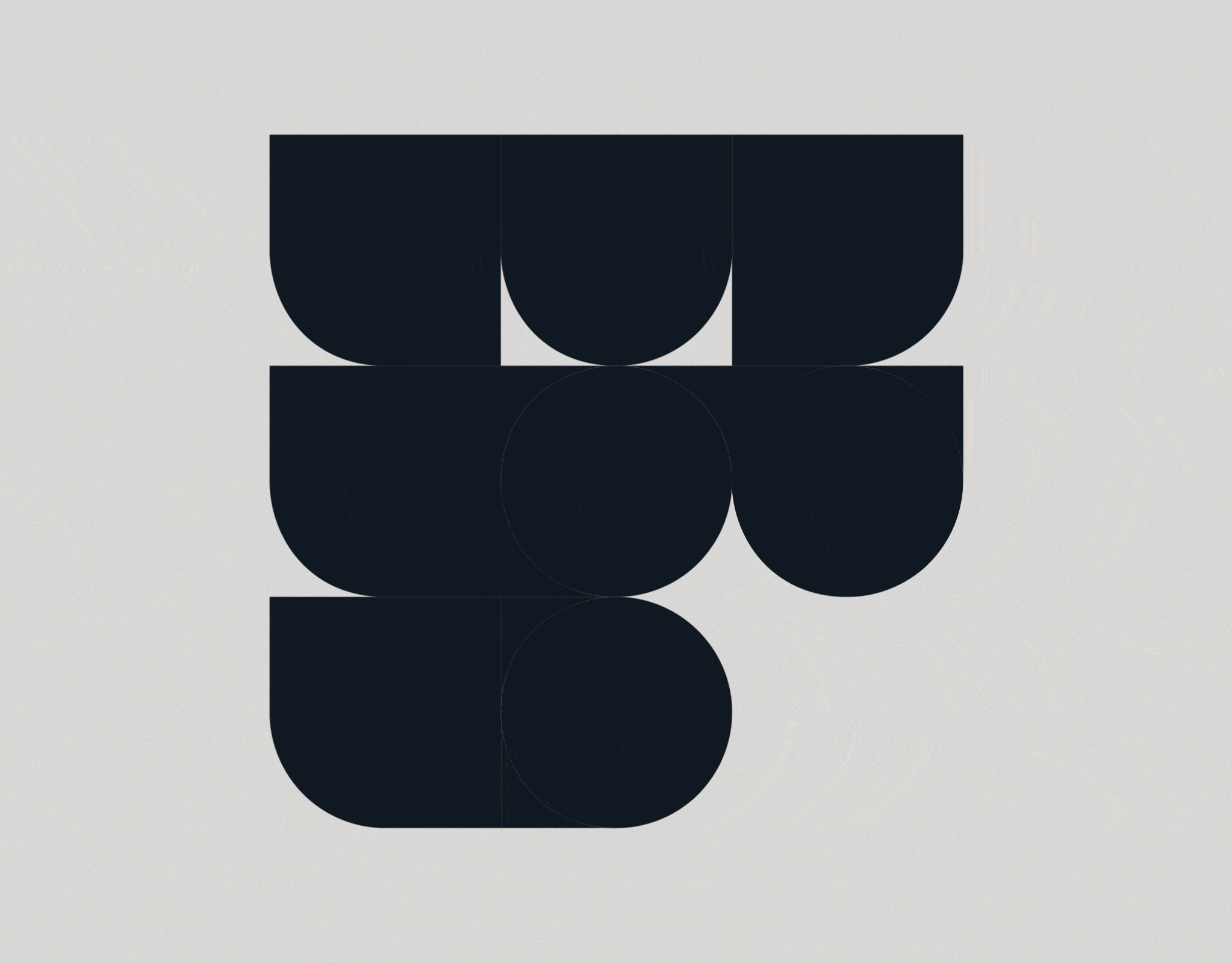
Logo Story
The revitalized logo embodies the museum's contemporary architectural identity, symbolizing the seamless integration of historical heritage with advancements in science and culture. This visual identity reinforces ROM's role as a bridge between tradition and innovation, providing a distinct and cohesive brand presence.
새 로고는 박물관의 현대적 건축 정체성을 구현하며, 역사적 유산과 과학·문화의 발전이 조화된 모습을 상징합니다. 이 시각적 아이덴티티는 전통과 혁신을 연결하는 ROM의 역할을 강조함으로써 명확하고 일관된 브랜드 이미지를 제시합니다.

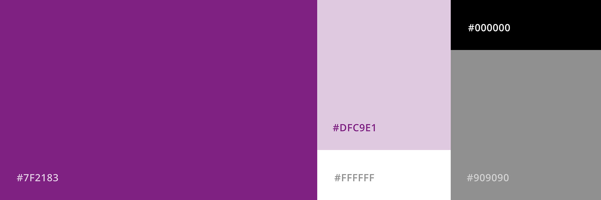
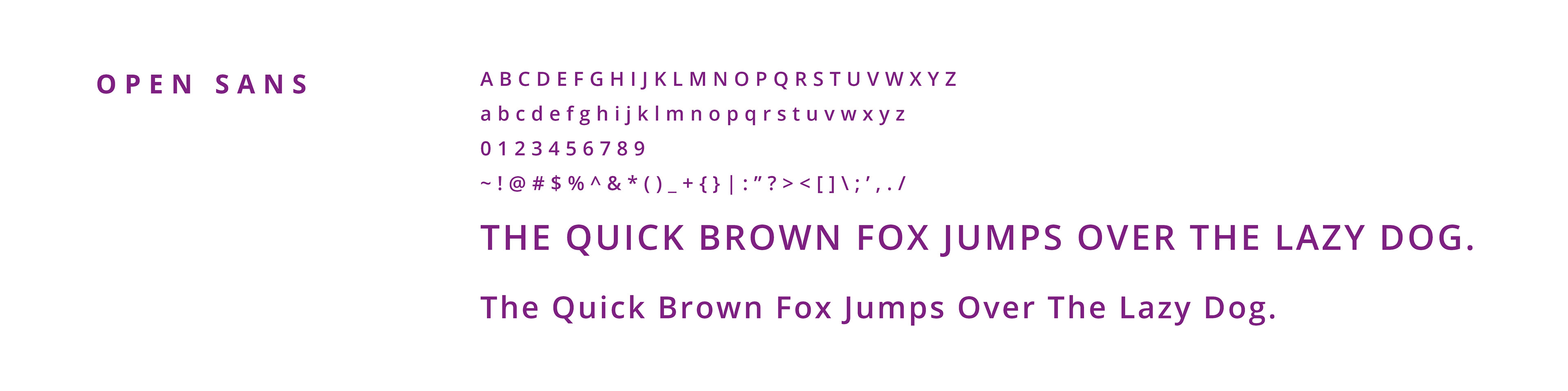
Colors & Typefaces


Prototypes
Dotted objects are interactive.